Google just released the new and improved Android 11 with a few surprises along the way. One of these surprises was the fact that users could update to the new mobile OS right after the announcement. Google seems to have hit it out of the ballpark this time, with no issues reported by users after the upgrade to the new version.
Android 11, at least at first glance, doesn’t seem to deviate from the clean design that Google is peddling these days. Much of the changes are under the hood, in the functionality and optimization departments, as Android is far from the experimental mobile OS that it once was. Now the direction is crystal clear. Users know what to expect in advance, with no crazy gimmicks or risky new bold user interfaces.
In the past years, every Android iteration has come with its share of improvements and absent or requested functionalities. But is this true for the newest Android version? How was it improved and how is gonna help you during your 9 to 5? To get an answer, we looked out of our media circle. We went “to the streets” and found a SuperDad who is also a black belt ninja in software development and asked him to give us his 2 cents about the new Android 11.

*Why a SuperDad? SuperDad is the typical reader of our site. Young, dynamic, with a keen eye for tech that has the potential to simplify our lives, and always looking to the future. He also might or might not create some software you use every day.
This being said, here is SuperDad’s review of Android 11.
This review is the result of about five days of using the latest version of Android 11 on a Pixel 3. First things first, let us start with the update process. It was a random Tuesday evening (September 8th) and I was scrolling Reddit when an article on the 15 android related subs I follow announced that Android 11 was out.
Google does this thing where updates come out, and they don’t send out a notification to every single eligible user, which is probably a good thing for their servers. It also allows Google to catch any fatal flaws before they brick millions of devices at once.
For me, this is especially annoying because I want to have the new shiny thing NOW! But even if you do not receive a notification, you can access the settings menu and press on the check for update button, and it will immediately query the update server and start the download.

Photo by Kevin Jarrett on Unsplash
The update pack was about 2GB in size, and it got my unit pretty hot, to the point I considered some pancake mixture and a pan. The overall process was pretty quick. I did notice some sluggishness but a quick restart made it all go away. Also, I noticed that I gained 1 GB of storage space, but I can’t say if this is just an OS size optimization or a coincidence.
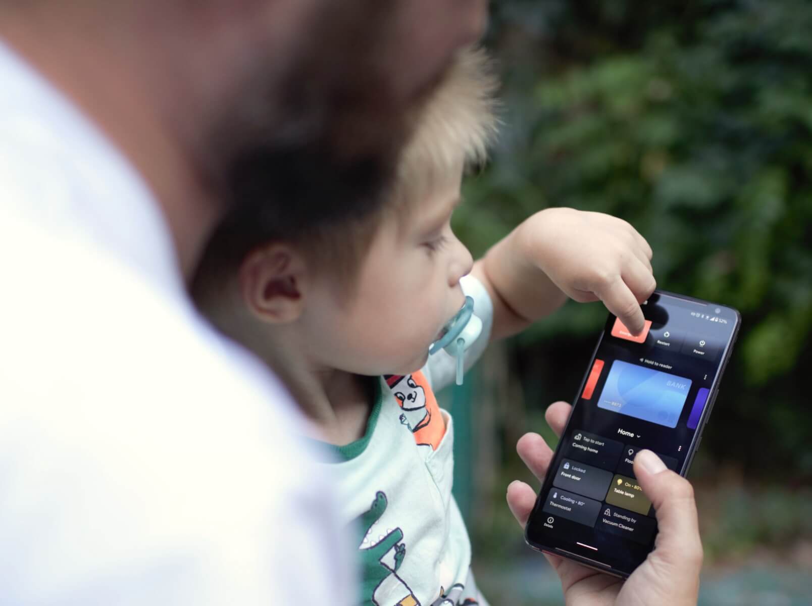
Revamped power menu
The first thing I noticed is the revamped power menu, which allowed me to control smart home integrations like the lightbulbs, the power sockets, air purifier, and everything else I would normally have to do using the Google Home app. It’s way more convenient as I can access them at any time, and I don’t have to go hunting for the app icon in a drawer full of icons.
Another feature that should be there is quick access to the Google Play cards. But it doesn’t appear to me… even though I do use Google Pay!? But it isn’t officially available in my region, and I am using a sideloaded APK to access it using a Revolut card, so maybe that’s why. I am only using a single card to pay with my phone, so this isn’t a considerable loss for me.
Photo by Mika Baumeister on Unsplash
The reason I went in the power menu in the first place was to take a screenshot, but that feature was missing from the tab menu. If you want to take a screenshot, you have to do it the old fashioned way of holding down the power and volume down buttons at the same time. That is kind of lame, and I would honestly really appreciate it if we could bring back the screenshot from the power menu feature.
Screenshots and Floating Icons
Speaking of screenshots, they do not appear in the notification shade anymore, but in the bottom left corner of the phone as a floating icon + the share and edit buttons before fading away in about 5 seconds. You can also dismiss it by pressing a little x on the icon.
Media notifications stacking
Another nice feature is the stacking of media notifications. I use Youtube, Youtube Music, Spotify, and Google Podcasts throughout the day, and sometimes I would end up with a notification tray cluttered with these media notifications. Now they are all stacked like the iOS 14 Widget Stack, and you can swipe left and right to navigate through them. When you press play on one of the widgets, it gets automatically pushed to the top of the stack, so you don’t have to hunt down for it again if you want to use the media controls.
Bubbles
I discovered the messaging Bubbles by accident while trying to read a one-time access code for the company VPN. It’s very similar to Chat Heads by Facebook Messenger with one key difference: If you are watching a youtube video in fullscreen these Bubbles will disappear while Chat Heads will hover above your video. You can summon the Bubble with a swipe from the top or the right side of the screen (while in landscape mode).
For my Devs Brothers
One interesting aspect of this version is the fact that Android 11 is capable of executing ARM binaries with significantly improved performance. Previously, developers who were dependent on ARM libraries and could not build an x86 variant of their app either had to use system images with full ARM emulation, which are much slower than x86 system images when run on x86-based computers, or resort to physical devices. The new Android 11 is capable of translating ARM instructions to x86 without impacting the entire system. This allows the execution of ARM binaries for testing without the performance overhead of full ARM emulation. I know this is interesting for just a few of you, but for some segments of the dev community, this is actually good news.
My 2 cents
And that’s it. I know there is more to this update but that’s all I had time for so far. Overall it’s an improvement but on the surface, it didn’t warrant a whole version increase. This feels more like Android 10.1, but maybe the behind the scenes changes or the ones I didn’t experience yet are the ones that pushed it over the edge to become Android 11.
Disclaimer: I am not a reviewer, I am just a busy father who also happens to be a part-time Google fanboy, so there are features of this update that I have not used yet and perhaps never will.
That was SuperDad and his take on Android 11. If you want to hear more from him, let us know in the comments below and share your experience with this new update from Google.
Follow TechTheLead on Google News to get the news first.


Harmony
September 18, 2020 at 4:39 pm
Screenshots (and also the select feature) are now moved to the task switcher. But only the Android 10/11 version with a thin horizontal line at the bottom of the screen (not the 2 button, or 3 button pill)
Swipe up from the bottom and hold :- this gives the task switcher, and under every app there are two options (screenshot and select)