Google Search on mobile is getting a new design, for a better user experience and – why not – better aesthetic?
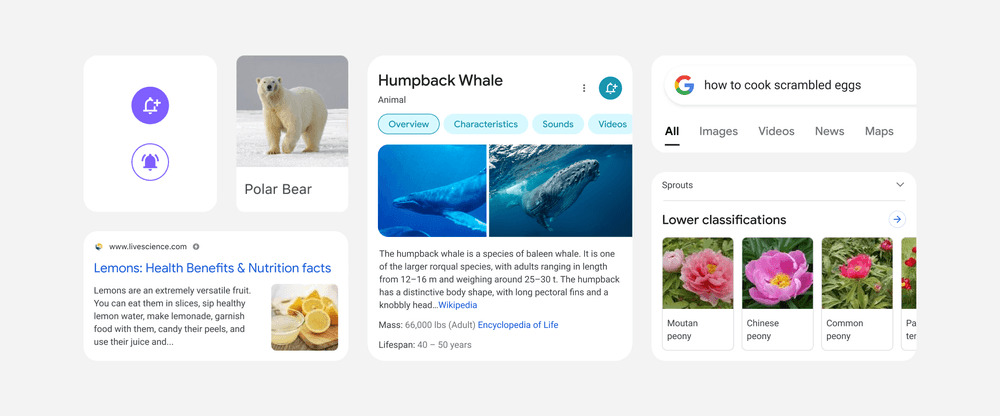
The company’s latest blog post offers insights from the designer, and it looks like the new design will have an edge-to-edge design, with more vibrant colors and an overall “bubblier and bouncier” appearance.
“We wanted to take a step back to simplify a bit so people could find what they’re looking for faster and more easily,” she says. “I find it really refreshing. To me, it’s a breath of fresh air!” said Google designer Aileen Cheng.
Rethinking the visual design for something like Search is really complex,” Aileen says. “That’s especially true given how much Google Search has evolved. We’re not just organizing the web’s information, but all the world’s information. We started with organizing web pages, but now there’s so much diversity in the types of content and information we have to help make sense of,” Aileen continued.
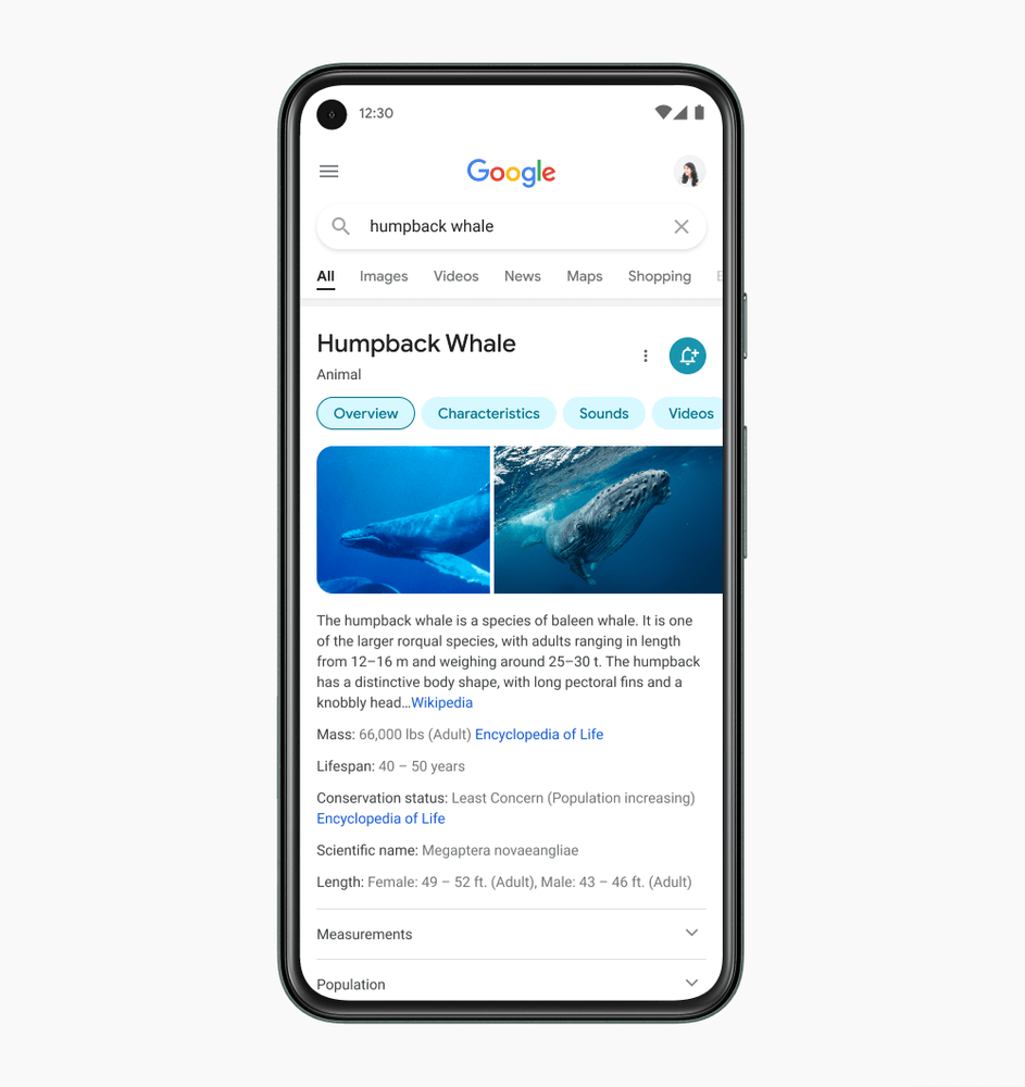
For better scanning, the text will have larger and bolder text, while search results will also occupy more of the width of the screen, thanks to reduced shadows. Colors will be used “more intentionally” to highlight essential info you don’t want to miss out.
Moreover, Google’s logo will be included in the icons and images, as “that form is already so much a part of our DNA. Just look at the Search bar, or the magnifying glass,” Cheng adds.
Consumers will be able to enjoy the perks of the new redesign on mobile in the upcoming days, but Google hasn’t exactly said the exact day when the updates roll out.
Follow TechTheLead on Google News to get the news first.

