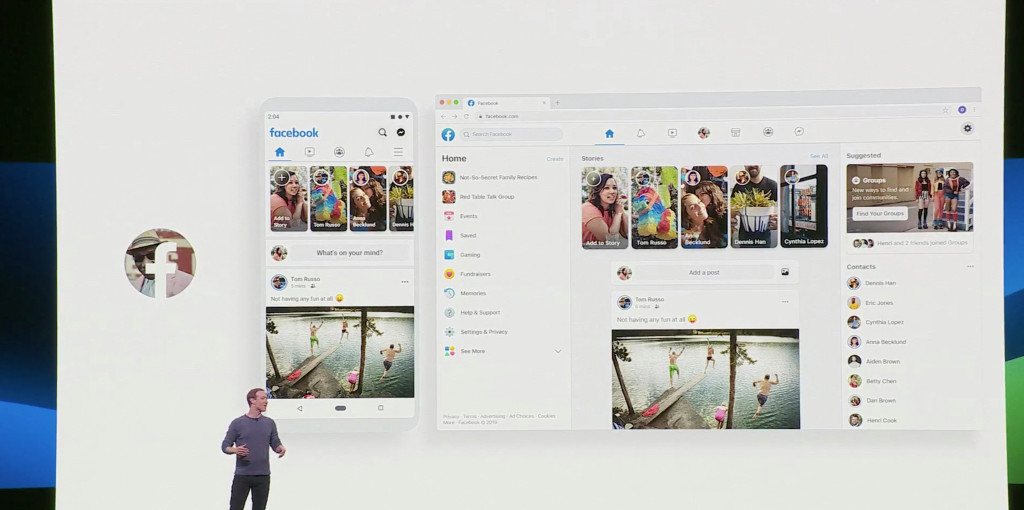
After announcing its design overhaul last week, Facebook’s app icon changed for iOS, going for a much lighter aesthetic. It’s the first change in years for the social media platform and it is more than welcome, considering the more modern look of Messenger’s icon.
Even though a few users were able to notice the new design in the app after being officially announced at the F8 developer conference, the dark blue logo only changed recently.
Its color now matches the Messenger app icon and the logo is centered compared to the offset “f” used before.
If you haven’t seen the change yet on your iPhone, you can take a look in the App Store where there are updated screenshots, like this one:
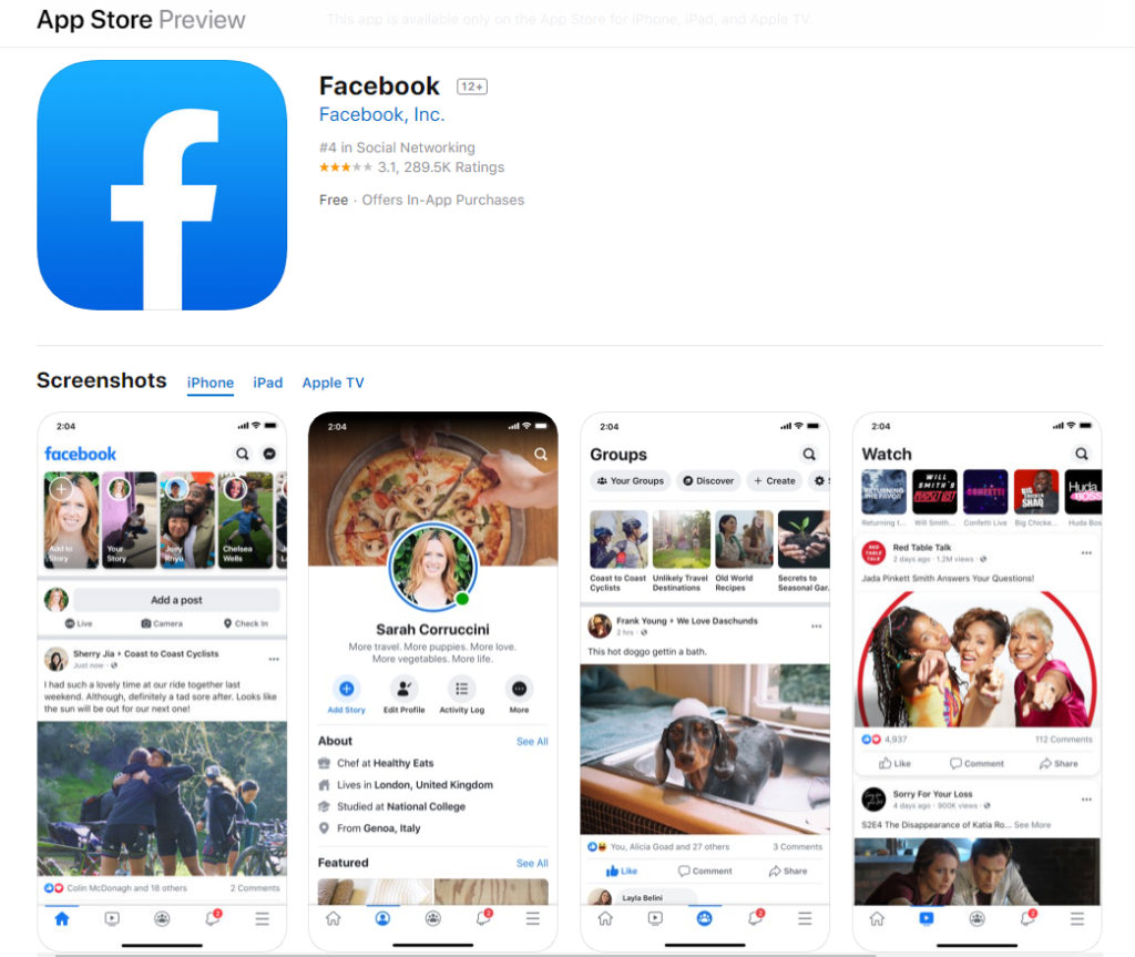
As for the Dark Mode announced, expect to witness it first on mobile in the Watch tab.
Follow TechTheLead on Google News to get the news first.

