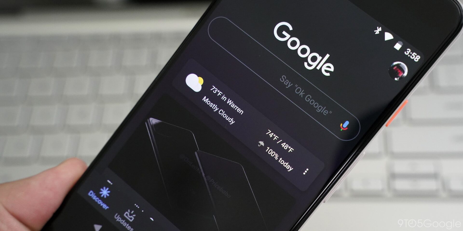
We recently told you about a Dark Mode for Google Photos and it seems that now, a Google Discover, Assistant and Search is available for some users that are running the latest beta release.
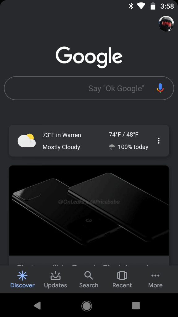
Back in April, we heard rumors of a dark mode being in development for the Google app. Now, some users have the opportunity to test it on their Android devices.
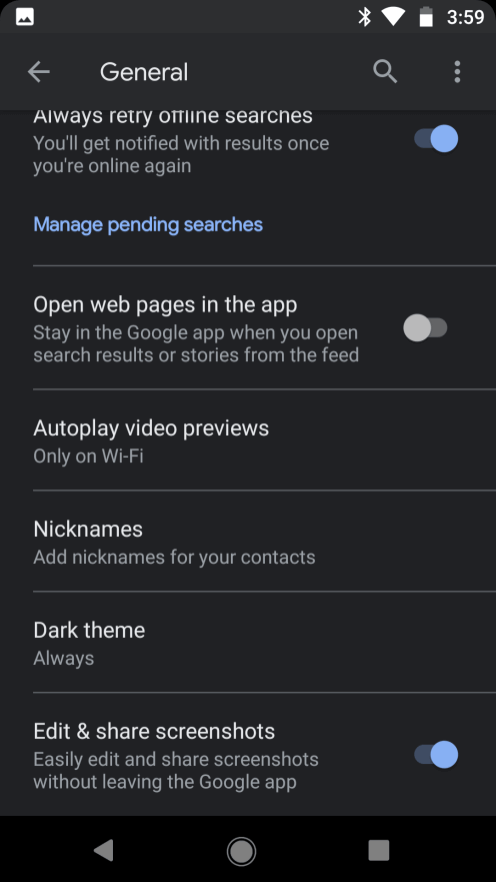
To do so, user should check Settings > General which will reveal a “Dark theme” menu on the bottom of the list. “Enable dark theme” allows you to select Never, Follow system setting (battery saver), or Always. Pretty intuitive, huh?
The dark mode for Google app shows up from the Discover tab where the shades of gray replace the white background – rather than plain black for AMOLED screens. Also, you will notice that the four-colored Google logo turned into white now, while the faint outline of the Search bar is gray.
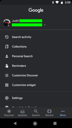
Just like on the Pixel Launcher, cards are themed to match the Discover feed at the left of the home screen.
At the bottom bar, users will notice a dark background while the icons and text labels remain gray. As a result of the Dark Mode, other tabs, like Settings, Google Assistant and Updates tabs are also darkened.
However, the most significant impact of the new mode can be seen in Google Search, where everything is dark gray, with the Search result cards being just a little bit lighter than the rest. The page names and headlines are illustrated in a darker shade of blue and the text is a lighter gray.
Follow TechTheLead on Google News to get the news first.

