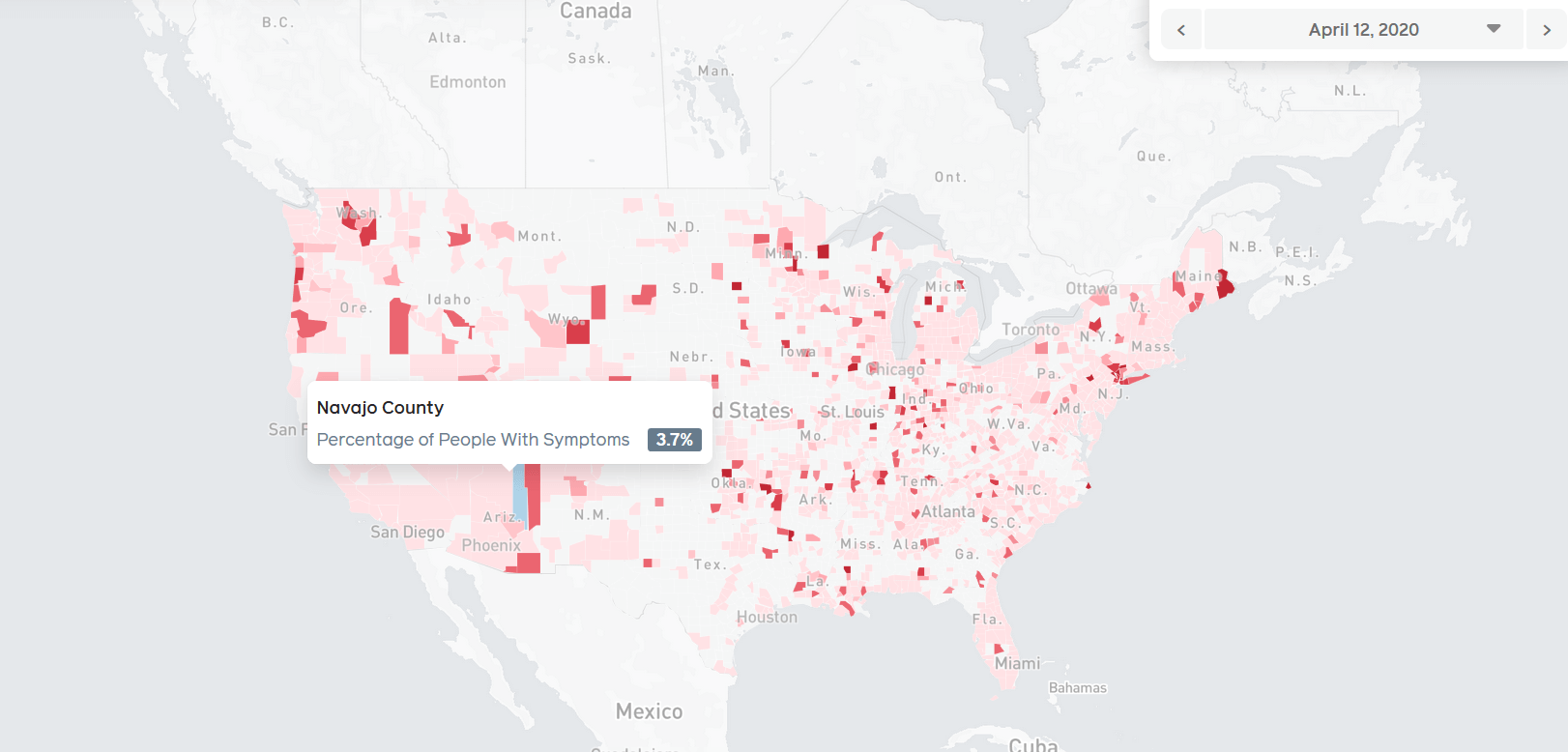
A new COVID-19 map was released by none other than social media giant Facebook and its interactivity level seems to go beyond what’s currently available in the US.
However, it does not show the number of people tested positive for a COVID-19 infection.
Instead, it shows the number of people from the US who have reported symptoms of it.
Considering that tests are done on a select few in each county, this map better shows the infectious spread of the coronavirus and how many people could, in theory, be infected.
Of course, since the users reporting symptoms were not tested, not everyone on that map is necessarily a COVID-19 carrier.
Facebook built the map using the data from a survey of over 1 million people.
The survey itself was conducted on Facebook by Carnegie Mellon University researchers over two weeks and will continue every day, with new samples of Facebook users, in order to keep the map updated.
“Facebook is uniquely suited to run these surveys because we serve a global community of billions of people and can do statistically accurate sampling,” said Mark Zuckerberg in the post that revealed the initiative.
And, for those concerned about the security of that data, he also offered this:
“We do this in a privacy protective way where only the researchers at Carnegie Mellon see individual survey responses — and Facebook only sees aggregated data.”
You can find the map and more information here.
Follow TechTheLead on Google News to get the news first.

