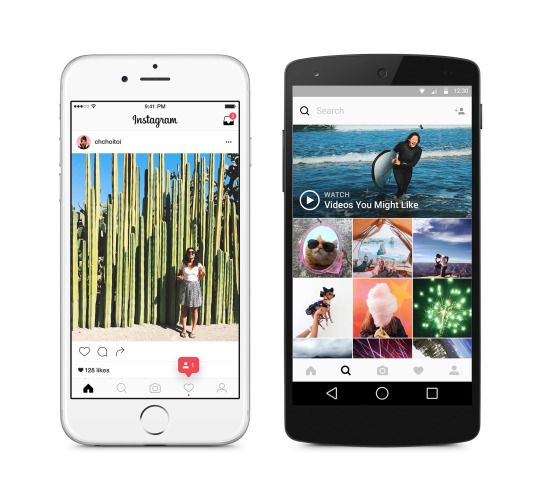
No, you’re not blind. If you just updated your Instagram app and can’t seem to find it anywhere on your mobile phone, chill – it hasn’t disappeared and you’re still seeing well. The company just changed completely its logo and, as you’ll see once you open it, the interface #softwaremagic #mobilemagic
Finally, the popular social media app dumped its old-school logo, reminding of Polaroid in brown shades, and adopted a more colorful one. The only thing that’s common to the first look is the lens element, which has been kept center and forefront. Otherwise, you might confuse it with other photo applications that blend the colors of the rainbow in their design.
The interface looks different, too. Now, Instagram is devoid of its iconic blue, in favor of white and black, in order to highlight your content, the now main source of color on the platform.

Loving the new design or not? Tell us your opinion!
Follow TechTheLead on Google News to get the news first.


