OnePlus CEO Pete Lau just confirmed that they will be coming with a fresh visual identity for the brand. If you are a fan of the company, rest assured, chances are it won’t be disruptive or major, including just a few adjustments.
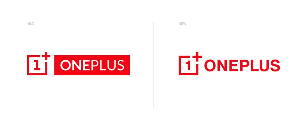
According to the company, “the logo introduces a new curvilinear “1” that is easier to read while adjusting the weight of the logotype for better overall balance. The “+” in the surrounding box has also been enlarged and is now more prominent, in a nod to the OnePlus community, which has played a key role in the company’s ongoing success.”

So the “1” within the logo has now been updated and the line at the bottom is missing, while the serif at the top looks different. The typeface of the logotype has also been updated and the plus sign looks slightly bigger. No biggie, right?
OnePlus also shared some cool stylized versions of the new logo in Weibo post, just for users to picture it in a more creative context.
As a reward for the new brand identity, users benefit from the company’s code “SAMEONEPLUS” to get $50/£50 off a OnePlus 7T from the official website.
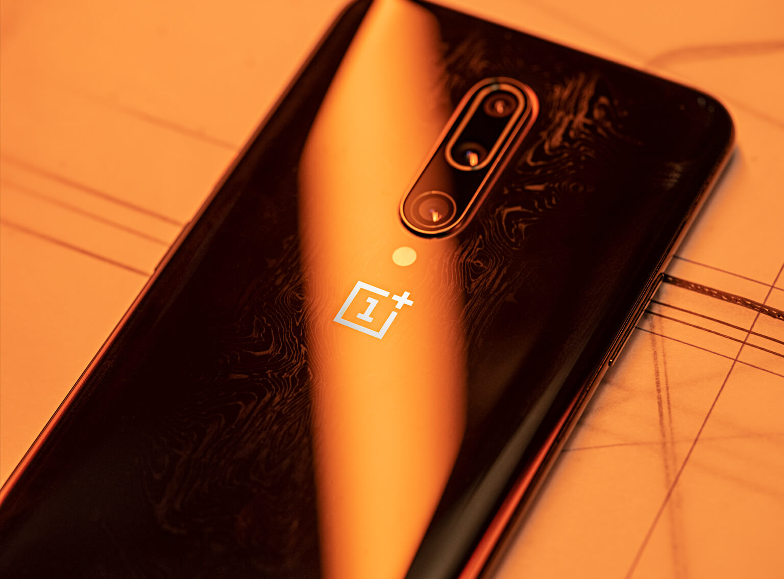
We shall probably see the new logo in April, on the back of the upcoming OnePlus phones.
Follow TechTheLead on Google News to get the news first.


